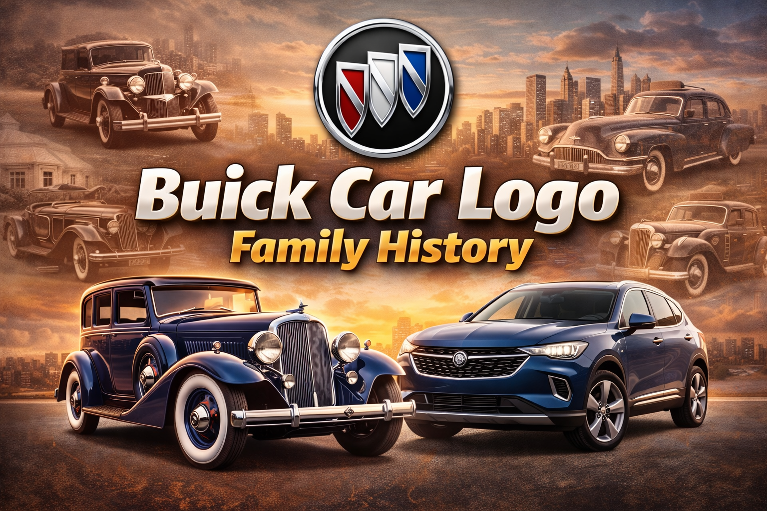
The Buick logo has a rich history, evolving over time to reflect the brand’s prestige, innovation, and connection to the past. Buick, one of America’s oldest car manufacturers, was founded in 1903 by David Dunbar Buick. Over the decades, its logo has undergone multiple transformations, but some key elements have remained consistent, notably the use of a shield and the incorporation of familial symbols linked to the Buick family heritage.
Key Stages in the Evolution of the Buick Logo:
Early Designs (1903–1930s):
The earliest Buick logos were relatively simple, often featuring the brand name in bold, stylized text. The first logos were mainly focused on advertising the name rather than any specific symbolism.
Introduction of the “Hawk” Emblem (1930s–1950s):
In the 1930s, Buick introduced a more complex logo that featured a hawk-like bird flying through a red, white, and blue circular emblem. This design was used to evoke a sense of freedom and power, aligning with the performance of the cars Buick was producing.
Trishield Design and Family Crest (1959):
One of the most significant changes occurred in 1959, when Buick adopted the now-famous “Trishield” emblem. The trishield is derived from the coat of arms of the Buick family. David Dunbar Buick’s Scottish ancestry influenced this decision, and the three shields in the logo represent the three core models Buick was offering at the time: LeSabre, Invicta, and Electra.
Each of the three shields features distinct symbols:
- Red Shield: Contains a stag, representing strength and nobility.
- Blue Shield: Often includes a diagonal checkered pattern, symbolizing the precision and engineering excellence associated with Buick cars.
- Grey Shield: Typically adorned with a cross or similar heraldic element, representing craftsmanship and tradition.
Modern Trishield (2002–Present):
In 2002, Buick refined the trishield logo, simplifying the design and giving it a sleeker, more modern look. The shields were placed inside a circular frame, and metallic, monochromatic colors were used to give it a more premium feel. This modern trishield logo aligns with Buick’s efforts to position itself as a luxury brand in the global automotive market.
Buick’s Symbolism in Relation to the Family:
The shields in the logo are directly connected to the Buick family’s Scottish heritage, rooted in heraldic tradition. Heraldry, which includes the use of shields and crests, was common among European aristocratic families, and Buick chose to emphasize this to give the brand an air of heritage, craftsmanship, and reliability.
The logo’s evolution—from simple branding to a stylized family crest—reflects Buick’s journey from its early days as a modest car manufacturer to its status as one of the premier brands in American automotive history.

